Learn what colors are trending in 2026 for the cabinet industry
Natural wood tones and soft neutrals are the leading 2026 cabinet color trends, along with earth tones and rich accents. Understanding how to incorporate these trends into a kitchen will help you guide your clients as they design a space that they’ll love for years to come.
We’ll review these 2026 cabinet color trends and how to integrate them into your client’s kitchen design.
In this article:
- Key Cabinet Color Trends for 2026
- Traditional vs. Trend-Driven Color Choices
- How to Choose the Right Cabinet Color for Your Kitchen Project
- Putting 2026 Color Trends into Practice
- Preparing for 2026 Kitchen Designs
- Frequently Asked Questions
Key Cabinet Colors Trends for 2026
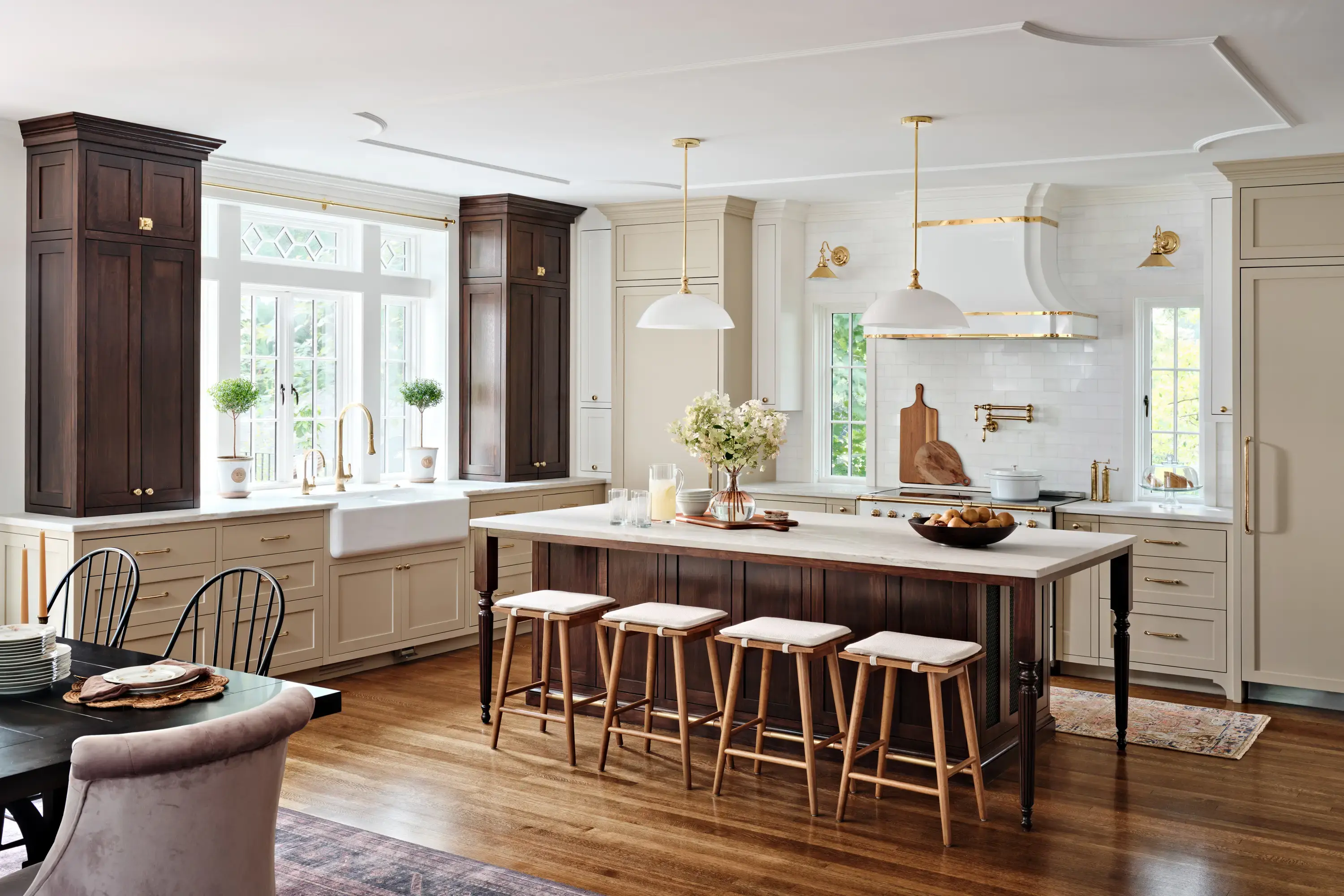
This year’s color trends lean towards timeless sophistication, with natural wood tones and soft neutrals coming out on top. For those who want to incorporate more of their personal style, bold accents can be incorporated throughout the design to make it unique and even more welcoming.
1. Soft Neutrals
Pantone’s Color of the Year for 2026 is Cloud Dancer, the epitome of a soft neutral. This choice for Color of the Year reflects a broader shift towards softer and more welcoming spaces. Using soft neutral cabinet finishes creates an open and airy feel. Choosing a subdued shade for the kitchen cabinets also allows other elements to shine, whether it’s architectural details, unique hardware, or stunning countertops.

2. Earth Tones
Past trends have leaned towards bright white and muted grey, but in keeping with this year’s natural theme, earth tones are warm and approachable. Earth tones include a surprising range of browns like taupe, chestnut, caramel, and tan. These, along with greens like olive, sage, and forest green and even earthy oranges, like ochre and rust, bring the feel of the outdoors inside, making people feel more connected to nature. 
3. Rich Accent Colors
Rich accent colors let your client infuse their personality into a space, especially if they’ve chosen soft neutrals as the cabinet color or have natural wood finishes incorporated elsewhere into the kitchen. You can incorporate deep, moody hues—think indigo and burgundy—through an accent wall or in accent pieces to add depth to the design. You can even suggest a rug with these colors. Choosing one or two rich accent colors allows them to stand out without becoming overwhelming.

4. Natural Wood Tones
Natural wood is simply timeless. While it’s gone in and out of fashion throughout the years, sometimes in favor of bold paint or modern materials like plastic, glass, or metal, we always seem to come back to it. Each hardwood species has its own natural undertones and grain patterns that create a different finished look. Walnut, for instance, takes dark stains well while maple, with its smooth, even grain, lends itself well to stain or paint.
The best way to keep the same look of natural wood cabinets without a significant price increase is to use veneer center panels instead of solid wood. Veneer center panels maintain the same look as a solid wood grain, but are more cost-effective and reduce the risk of cracking over time, which happens with solid wood center panels.

Traditional vs. Trend-Driven Color Choices
Color trends in cabinetry tend to stick to the traditional and classic. Dark colors like navy blue or hunter green serve to ground the space and make a statement, while neutral colors like grey or white create a classic kitchen with room to play with accents. When choosing the color palette, you can also consider the type of cabinets in the kitchen as well as the lighting and existing finishes.
For cabinets, sticking with timeless color palettes creates a kitchen grounded in tradition but also allows room for creative expression. Cloud Dancer, for instance, is a trending color, but it also supports traditional kitchen designs. Wood tones also support traditional kitchen designs and are neutral enough to allow trend-driven accents and colors. Both of these choices for cabinets allow for more expression in other areas with rich accents.
How to Choose the Right Cabinet Color for Your Kitchen Project
Step 1: Client Consultation
In this first step, you’ll get a feel of the client’s goals and preferences. While you’re discussing the kitchen, also note the feel of other areas of their home. Do they gravitate towards bright, vibrant hues or do they tend towards softer neutrals? Share your recommendations for colors, including those that are trending this year. Their needs can also guide their choice of kitchen cabinet organizers and other custom elements.
Step 2: Evaluate Light, Space, and Fixed Finishes
Before settling on a cabinet color, take a clear look at the jobsite conditions. Lighting and existing finishes will do more to determine the right choice than trends alone.
What to check first:
- Available light: Bright kitchens can support darker cabinet colors; low-light spaces perform better with lighter tones that keep the room open.
- Room size: Lighter cabinet colors help smaller kitchens feel less boxed in.
- Fixed finishes: If countertops, flooring, backsplash, and appliances aren’t changing, then the cabinet color needs to work with them, not fight them.
A successful project means thinking through the whole space upfront. Matching cabinet color to existing materials and working with the lighting and room size helps avoid rework and second-guessing later.
Step 3: Consider Material Selection
If the client is leaning towards natural wood tones, show them the wood types they can choose from. Help them understand how each reacts to different types of stain based on their undertones and wood grain patterns. If they choose painted cabinets, share the colors that you think will work best in their space.
Step 4: Use Color Psychology to Support How the Kitchen Is Used
Cabinet color affects how a kitchen feels and functions day to day. The goal isn’t design theory—it’s choosing a finish that fits the job and the client’s expectations.
General guidelines that hold up:
- Warm tones (white, off-white, light wood): Reliable, versatile, and easy to live with.
- Cool tones (gray, blue, green): Clean, modern, and popular in updated or new builds.
- Bold colors: Effective in the right space, but best used with intention.
Following kitchen cabinet color trends is a good strategy, as long as the color works long-term and doesn’t create issues down the line.
Step 5: Test Samples in Real Jobsite Conditions
Never make a final cabinet color call based on a screen or showroom sample alone. Lighting and surrounding materials will change how the color reads once installed.
Best practice:
- View samples directly in the kitchen
- Check them at different times of day
- Hold samples against countertops, walls, and flooring
Skipping this step is one of the most common mistakes and one of the easiest to avoid.
Step 6: Avoid Common Cabinet Color Mistakes
Cabinet color decisions should support smooth installs and satisfied clients to avoid any issues down the road.
Mistakes to watch for:
- Choosing colors that are too trend-driven
- Ignoring warm vs. cool undertones between materials
- Rushing the decision to stay on schedule
A good cabinet color choice is one that installs clean, holds up over time, and keeps the project moving without surprises.
Step 7: Final Finishes
When you order from Eagle Woodworking, you’ll receive unfinished doors that you can stain or paint. We also offer single coat or double coat primed doors to save time on painted doors. When the finish is complete, it’s time to install them and complete the project. Our 1 to 2 week lead times mean you complete the project and get your clients into their dream kitchen as quickly as possible.
Putting 2026 Color Trends into Practice
A well-planned kitchen project not only reduces kitchen clutter, but it also guides the feel of the space. Neutral kitchen palettes that use natural wood tones, soft neutral, and earth tone paint colors offer your clients the opportunity to feel grounded and calm in their space.
There are a number of ways to integrate 2026 trends into your project:
- Two-toned cabinetry: If your client wants to incorporate bold cabinets, you can suggest a two-toned approach. Putting the more muted cabinets on top with richer-toned ones on the bottom creates visual interest without overwhelming the space.
- A minimalist approach: For clients who prefer a minimal look, stick with warm wood or soft neutrals for their cabinets.
- Full color cabinetry: This year’s color trends really support full color cabinetry without getting too dark. Choosing warm woods, soft neutrals, or earth tones for the entire cabinet adds a welcoming feel to the kitchen.
Preparing for 2026 Kitchen Designs
While it’s likely not possible to update kitchen cabinet colors every time a new color trend takes hold, it is possible to pay attention to color trends as you’re recommending cabinet color selection for new client projects. The great thing about 2026 cabinet color trends is that they will remain timeless. Unlike other years that have seen brighter or cooler colors, this year’s trends are more neutral and muted and meant to create a warm and inviting space.
Including up-to-date color choices can increase the project’s appeal and client satisfaction. They’ll see that you’re paying attention to what’s happening in the industry, which can build their confidence in you and your recommendations.
When working with Eagle Woodworking for custom doors and finishes and cabinet storage ideas, keep the client’s color choices as well as cabinet finish trends in mind. Our ability to manufacture customized doors with a 1 to 2 week lead time will give you time to complete the finishes and install the cabinets within your project’s timeline.

Frequently Asked Questions
What are the simplest 2026 trends to implement in existing kitchens?
The simplest 2026 trends to implement in existing kitchens include quick updates to areas like the island or accent walls. These can be painted relatively easily, allowing the client to showcase trending colors. Another easy update is to bring in bold accents, whether in the form of new dishes, an accent wall, or light fixtures. If the cabinet boxes are sturdy but the doors are damaged, you can also consider cabinet refacing, which replaces the cabinet doors for a refreshed look at a fraction of the cost of new cabinets.
How do I choose the right finish for natural wood tones?
The right finish for natural wood tones depends on the type of wood species that you’re finishing. Maple, for instance, takes stain well because of its smooth, even grain. White oak has a strong grain pattern and is naturally resistant to wear, so it’s a great choice for high-use kitchens. Walnut has deep, rich tones that make it ideal for warm and dramatic designs. Stained cabinets may need to be restained and sealed periodically to refresh the space and maintain their durability.
Can bold accent cabinets work in small kitchen layouts?
Bold accent cabinets can work in small kitchen layouts when used with intention. The homeowner may not want all of the cabinets to feature a bold finish, so you can recommend that they use bold accent cabinets in their kitchen island or forego bold cabinets altogether in favor of neutral tones. An alternative to bold accent cabinets is to work in more color in other elements of the kitchen, such as light fixtures, chairs, centerpieces, and dishes.
How should I factor Eagle Woodworking’s lead times into my project schedule?
Eagle Woodworking offers typical 2-week lead times for cabinet doors, so you can schedule your project around that and lead times for other elements. You can work other projects like flooring, painting, and countertops around this lead time to set a schedule that works for each individual project.
Are certain 2026 color trends better suited for commercial versus residential projects?
Commercial color palettes differ from those in residential projects because commercial designs often include branding elements. From symbols to colors, commercial projects may be less likely to jump on a 2026 color trend in favor of sticking to their brand. Many commercial designs move away from an overall neutral color palette, but soft neutrals and warm wood tones still have their place. Discussing your client’s overall design needs and how they want the space to feel can help you guide them in the right direction when choosing a color palette.